UI Animation Design: Turning Concepts Into Reality
The ‘Concept’ Of UI Animation Concepts
You have probably heard of concept art: drawing up designs to try and get a general idea of where your project is headed, how it will function and what it will look like. UI animation concept art is only a little bit different, being ‘motion design’ which you’ll need motion designers for. For UI animation concepts, you’ll be thinking about ideas for interactions, control manipulation and transitions, among others. Your designers will be using software such as InVision and Adobe After Effects, and many more depending on what they’re personally comfortable and experienced with.
But don’t let the initial need for a professional put you off – brainstorming doesn’t need a designer, and basic sketches and ideas can be beneficial to whoever works on your ideas for you. As long as you keep in mind that your designs need to move, and the still nature of your images doesn’t make you forget this, you’ll be fine getting started on your own. In this primitive first stage, the sky’s the limit, so try out ideas and find something you want to be turned into a reality.
Why Do You Need UI Animation Concepts?
If you were just making another normal app, with a normal, static design, then no, you probably wouldn’t need elaborate and detailed concepts. You could find a cookie-cutter design and fly with it, churning out your app quickly. But your audience won’t notice it! It’ll blend in, grey, bland and boring, and you don’t want that.
At first, trying to create UI animation concepts may seem scary. It may seem impossible. But don’t fear – every choice you make that seems ‘impossible’, there’s likely a way that it can be achieved, and UI animation concepts are the place to explore the unreal; maybe even the ‘needless’. But it’s not just your brainstorming that benefits from this concept art.
The general market, looking for new ideas and designs, will jump on any UI animation concept art you put out there, and this is when your concept becomes concrete. “This is when coders come to you and show you how your ideas can work, and what they can do to make them possible. Developers often bring amazing practicality to the table, even when they’re strictly consulting, freelance or temporary help. Your UI animation concepts make all of this possible” says Pam Rea, a design blogger at Paper fellows and Australianhelp.
But don’t forget, you’re not just being unique and inventive for the sake of it. All of this turns into interest from your audience, and delight from your users. It creates a higher quality app for you and everyone who uses it, meaning that high reviews and lots of downloads and shares. This is the future of design, so you need to be a part of it, otherwise you could find yourself falling behind with the other soulless, copied over and over apps that are available, and nobody wants that – not your audience, nor you.
Where Exactly Is It Useful?
Don’t get caught up in where you’re going to use your UI animation – it can be worked into your overall design in many, many ways. An exciting aspect of your app might want to attract attention, or a transition could be spiced up by moving animation. Loading screens, if you have any, should be given special attention, since they are often a source of user-frustration, and anything to alleviate their boredom while your app (or sections of your app) load will be appreciated, trust me.
Be Wary Of The Downsides
However, UI animation isn’t all fun and games. If your animations are too rapid, they can become an annoyance to your users, and particularly garish or obnoxious colour changing can have the same effect. Also, piling up the UI animation on all of the aspects of your app might not be a good idea, unless you’re sure that it works with the overall design and aesthetic of your app. If not, cut it down to what you need and what works, not what you want.
You’ll also need to invest in developing UI animation design with a moving animation specialist, or team depending on your budget and ambition. But, unless you have connections in the industry, it’s likely that you’ll need to set aside some money for the development, and make sure that your business can support that. If it’s not feasible for your team, then maybe planning ahead and working slowly towards the end goal of UI animation design for your app is a better idea.
Specific Examples Of UI Animation Design
Dynamic Lists
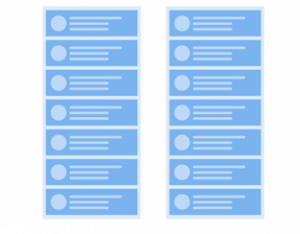 Instead of general, scrolling lists, which you see everywhere, consider more dynamic lists. You can have items move about in a lively manner, almost like they’re cards which are tied down a little. This feels fun and creates an airy atmosphere which UI animation design should thrive off of, whilst also giving the impression that your list is longer and more substantial than it actually is.
(https://uxplanet.org/animation-in-ui-design-from-concept-to-reality-85c49907b19d?gi=7c9b1f0f725e)
Clever To-Do List
Another example would be a ‘clever’ to-do list, where items which are checked off have a fun crossing-out animation (a line running through the words of the item) then move themselves to the bottom of the list. This not only looks incredibly aesthetically appealing, but it also shows the smart side of UI animation design, since this cleans up the user’s list and shows them clearly what needs to be done (at the top) and what has been completed (at the bottom). Of course, the moving animation makes the whole design fluid and look amazing, which users will love as well as the practicality.
(https://dribbble.com/shots/4739703-Todo-List-Interaction-UI-Animation)
Elegant Side Menu
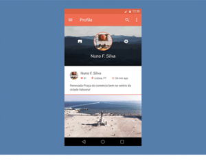 Your side menu, if you have one, may anchor your entire app, so using UI animation design to make it look better is an excellent idea. A side menu could ‘balloon’ out from the icon, traditionally in a top left or right corner, going from a semi-transparent colour to a solid colour and expanding until all options can fit into the menu, and it is full-size. This makes the transition smooth, and improves the look of your app.
(https://dribbble.com/shots/1832898-Side-menu-pull)
Notifications
 Sometimes, it’s the smallest things that lead to the biggest impact. You can think as small as a notification symbol, like a bell, shaking from side to side when the user has a notification. This will grab the user’s attention, especially the first time they notice it, and it’s a nice little touch which tells the user you have good attention to detail. Its functionality won’t be ignored, either, and will surely be appreciated by your users.
(https://dribbble.com/shots/3861781-Daily-UI-049-Notifications)
Pulling Items From Lists
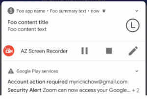 Instead of just sliding to a new page for an item from a list when a user taps on it, why not utilize some UI animation design and extend the item down until it is an entire page, stretching the elements and adding new elements until it is at the correct dimensions? “This will give your list a unique look, and make opening list items fun for your users. It can give the two pages (list and item) less of an isolated feel, which so often happens with clunky designs, making the entire experience better for your user” comments Jeremiah Adams, a web developer at Boomessays and State of Writing.
(https://itnext.io/android-inboxstyle-notification-as-deep-as-possible-4d74c0c725f1)
Welcoming Tutorial
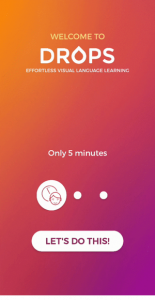 If your app isn’t so simplistic that it needs no instructions, then you’re likely thinking about implementing a tutorial. While one screen after another may work functionally, it’s not really that attractive, and little images and arrows on the screen don’t have the ‘wow’ factor either. Having sliding screens which fade into each other and have a recurring moving image making the impression of changing scenes with some consistency – that’s impressive! It feels like a short movie instead of a tutorial, which entices users and creates the impression of high quality immediately.
(https://www.reallygoodux.io/blog/drops-effortless-visual-language-lessons)
UI Animation Design – For You?
UI animation design might not be a feasible option for everyone, but if you can manage to get the resources and connections together, you will not regret it. Having moving animation within your app makes it stand out, and guarantees some interest from your audience, who will be delighted at a new, fresh entrance to a stagnant, stale market for apps. In a world where everyone can make the same old app over and over again, with the same UI over and over again, and even the same colour scheme over and- you get it. This is your moment to shine.
What sort of features would you like to see moving in apps that you use daily? Is it profile pictures, settings menus, text, loading screens or something else entirely? Drop a comment down below and brainstorm some cool ideas for the future of design development!
Molly Crockett is writes for Academized and Assignment Writer. As a marketing writer, she shares her unique lifestyle tips and personal development advice with her readers. She also works as an editor at Essay Roo blog.

